Connectome Basic Workflow
Micha Sam Brickman Raredon
2020-05-13
01 Connectome Workflow.RmdConnectome is an R package to automate ligand-receptor mapping and visualization in single-cell data. It is built to work with Seurat from Satija Lab.
Data Preparation
CreateConnectome uses the active identity slot in a Seurat 3.0 object to define “nodes” for network creation and network analysis.
Node parcellation should be done carefully as it will have a non-trivial effect on downstream connectomics.
Load Data
Here, we run Connectome on the cross-platform Pancreas data distributed by SeuratData:
InstallData('panc8')
data('panc8')
table(Idents(panc8))
#>
#>     celseq    celseq2 fluidigmc1     indrop  smartseq2
#>       1004       2285        638       8569       2394
Idents(panc8) <- panc8[['celltype']]
table(Idents(panc8))
#>
#>              gamma             acinar              alpha
#>                625               1864               4615
#>              delta               beta             ductal
#>               1013               3679               1954
#>        endothelial activated_stellate            schwann
#>                296                474                 25
#>               mast         macrophage            epsilon
#>                 56                 79                 30
#> quiescent_stellate
#>                180
Scale and make connectome
Here, we normalize the data, identify the ligand and receptor genes that have mapped in the object, scale those genes, and generate the connectome. To accelerate computation time, we omit calculation of Wilcoxon rank p-values and gene-wsie diagnostic odds ratios. We also limit our connectomic analysis to only those clusters with > 75 cells captured, since small clusters may not accurately regress to reliable mean values.
panc8 <- NormalizeData(panc8)
connectome.genes <- union(Connectome::ncomms8866_human$Ligand.ApprovedSymbol,Connectome::ncomms8866_human$Receptor.ApprovedSymbol)
genes <- connectome.genes[connectome.genes %in% rownames(panc8)]
panc8 <- ScaleData(panc8,features = genes)
panc8.con <- CreateConnectome(panc8,species = 'human',min.cells.per.ident = 75,p.values = F,calculate.DOR = F)
Filter to edges of interest
This is a critical step which is both dataset- and scientific question-dependent. First, let’s look at the distribution of ligand and receptor z-scores and percentage expression:
# Change density plot line colors by groups
p1 <- ggplot(panc8.con, aes(x=ligand.scale)) + geom_density() + ggtitle('Ligand.scale')
p2 <- ggplot(panc8.con, aes(x=recept.scale)) + geom_density() + ggtitle('Recept.scale')
p3 <- ggplot(panc8.con, aes(x=percent.target)) + geom_density() + ggtitle('Percent.target')
p4 <- ggplot(panc8.con, aes(x=percent.source)) + geom_density() + ggtitle('Percent.source')
plot_grid(p1,p2,p3,p4)

Given these outputs, let’s filter the data to only include edges with a ligand and receptor z-score above 0.25 (thereby emphasizes cell-type specific communication patterns), and with both the ligand and receptor expressed in at least 10% of the cells in their respective cluster (thereby increasing statistical confidence):
panc8.con2 <- FilterConnectome(panc8.con,min.pct = 0.1,min.z = 0.25,remove.na = T)
We are now ready to begin making plots of this single-tissue system.
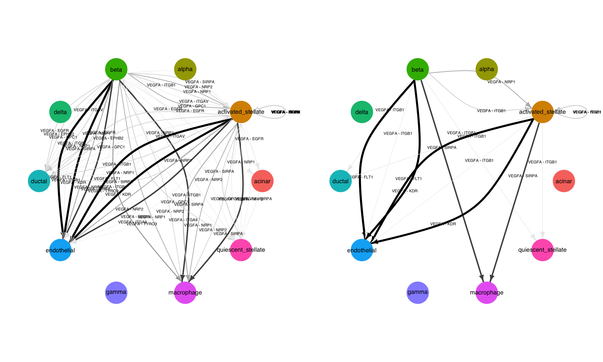
Network plot
This is the simplest form of network visualization. This function will take as input any parameters which can be passed to FilterConnectome, thereby allowing in-line filtration. Here, we exclusievely look at cell-cell edges involving VEGFA. We also show the effect of filtration based on percent expression:
p1 <- NetworkPlot(panc8.con2,features = 'VEGFA',min.pct = 0.1,weight.attribute = 'weight_sc',include.all.nodes = T)
p2 <- NetworkPlot(panc8.con2,features = 'VEGFA',min.pct = 0.75,weight.attribute = 'weight_sc',include.all.nodes = T)
plot_grid(p1,p2,nrow=1)
Centrality analysis
Built into Connectome is a function called Centrality, which performs a graph-theory based analysis of the input network. The user specifies how to subdivide the input network using the group.by argument. For each sub-network, cell types are ranked by their cumulative incoming/outgoing edgeweight and their Kleinberg directional centrality. This allows quick identification of top ligand producers and correlating receptor receivers, in each signaling subnetwork. Here, we group cell-cell communication in the pancreas by signaling family (‘mode’):
Centrality(panc8.con2,
           modes.include = NULL,
           min.z = NULL,
           weight.attribute = 'weight_sc',
           group.by = 'mode')
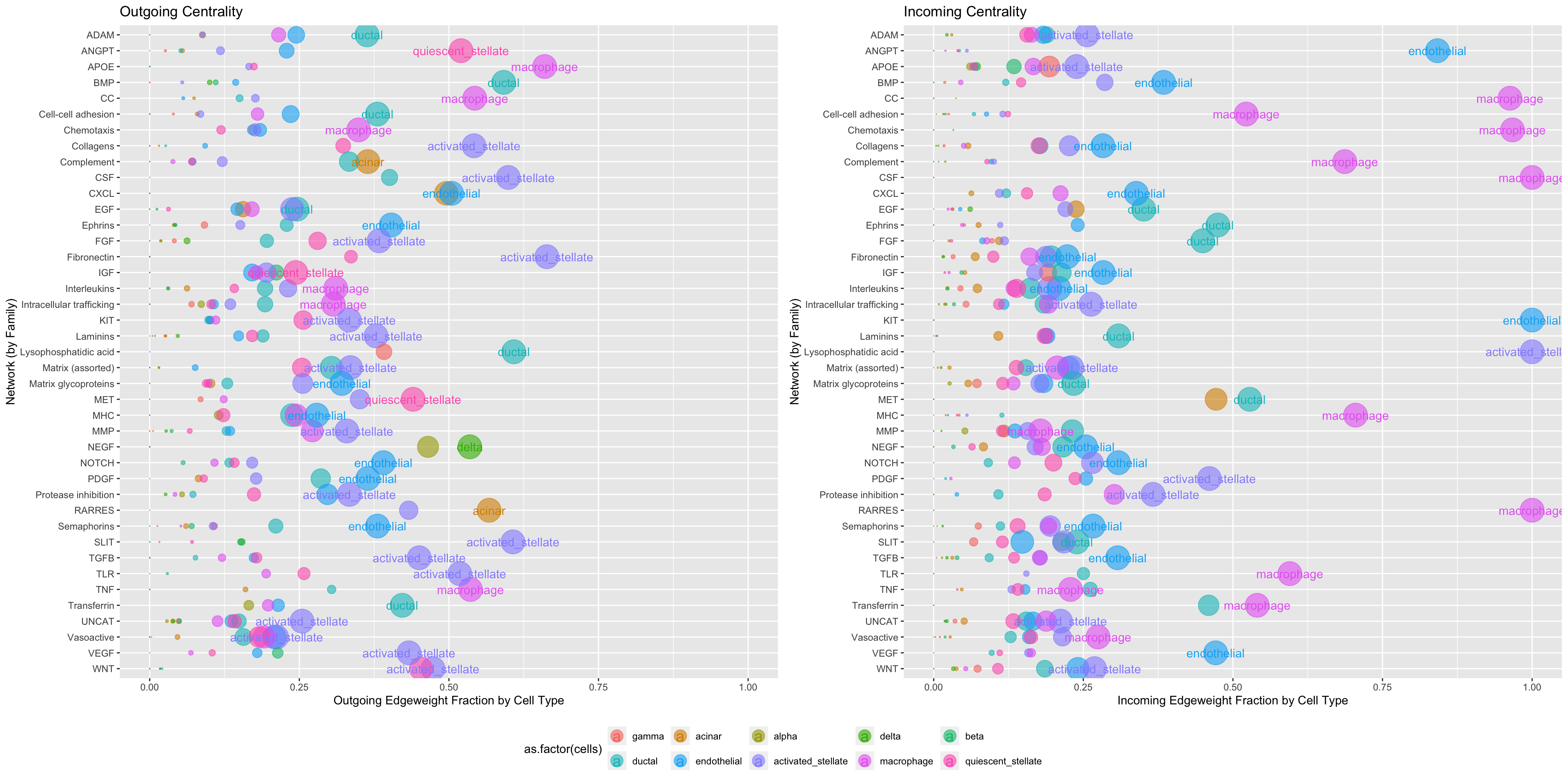
Centrality can also be used to look more closely at specific signaling families of particular interest, grouped here by mechanism:
Centrality(panc8.con2,
           modes.include = c('VEGF'),
           weight.attribute = 'weight_sc',
           min.z = 0,
           group.by = 'mechanism')

CellCellScatter
If a particular cell-to-cell interaction is of particular interest, CellCellScatter can be useful to immediately identify top signaling modes between those two cells. The x-axis is the expression of the receptor on the receiving cell type, while the y-axis is the expression of the ligand on the sending cell type:
p1 <- CellCellScatter(panc8.con2,sources.include = 'endothelial',targets.include = 'activated_stellate',
                label.threshold = 3,
                weight.attribute = 'weight_sc',min.pct = 0.25,min.z = 2)
p1 <- p1 + xlim(0,NA) + ylim(0,NA)
p1
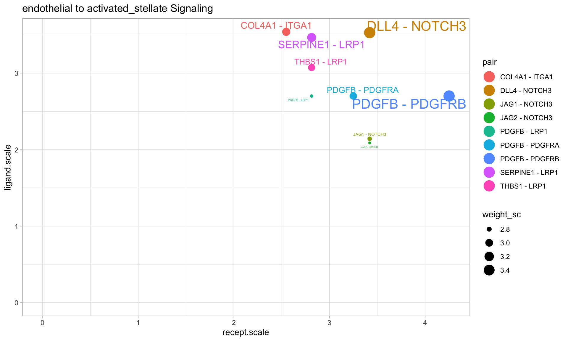 From the above plot, we can see that endothelial cells are prominently expressing DLL4, which might be sensed by the NOTCH3 receptor on activated stellate cells.
SignalScatter
It might then be important to ask if the DLL4-NOTCH3 interaction from the above example is exclusive to the endothelial-activated stellate cell vector. It is possible that although it is a top mechanism between these two cells, there may be another cell-cell vector which more strongly utilizes this pathway. To test this hypothesis, we can use ‘SignalScatter’ to investigate the entire DLL4-NOTCH3 network across all cell types. We also choose to include additional ligands which can be sensed by NOTCH3:
p2 <- SignalScatter(panc8.con2, features = c('JAG1','JAG2','DLL4'),label.threshold = 1,weight.attribute = 'weight_sc',min.z = 2)
p2 <- p2 + xlim(2,NA) + ylim(2,NA)
p2
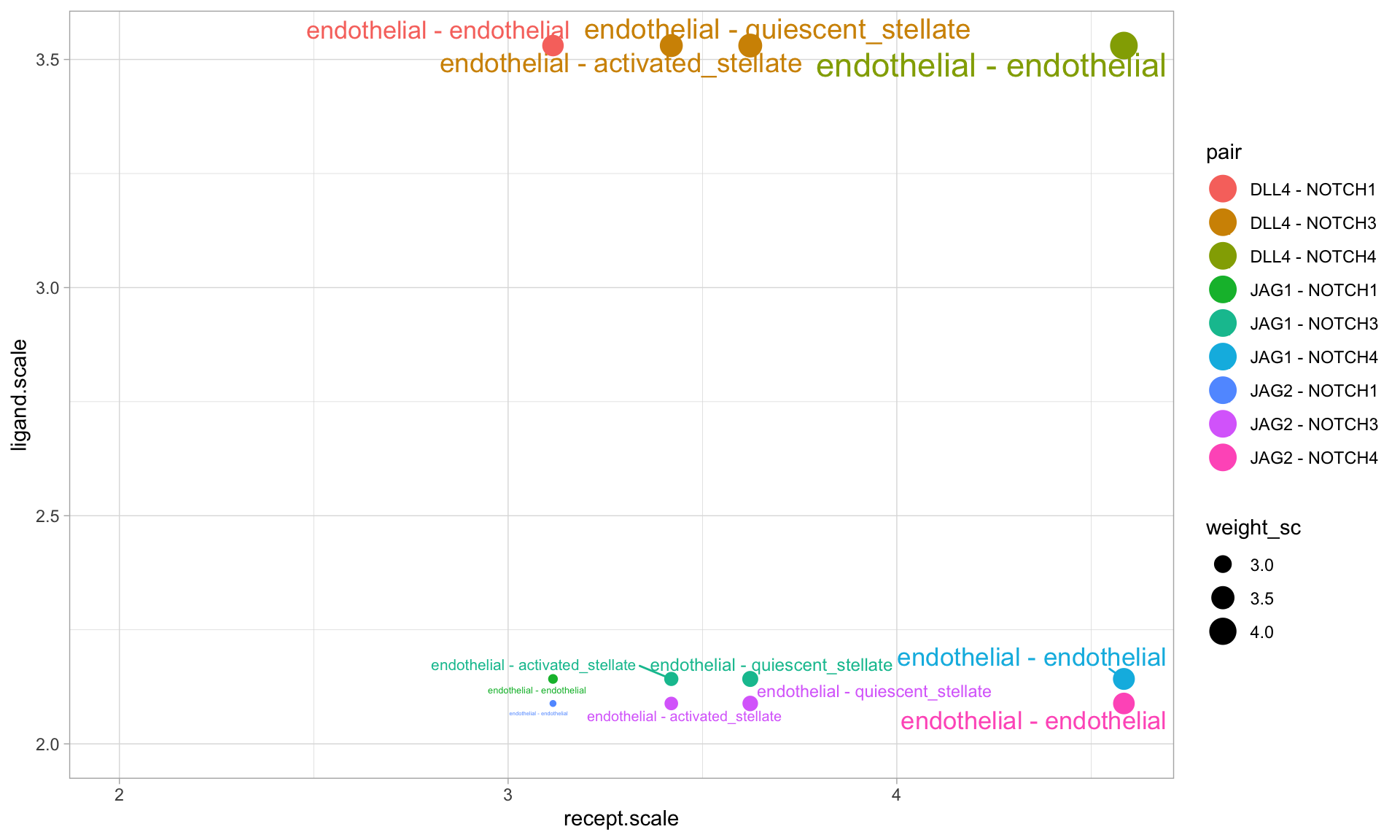 From this plot, we see that DLL4-NOTCH3 is most likely mediating communication between endothelial cells and both activated and quiescent stellate cells. Further, we can see that NOTCH4 is likley mediating endothelial autocrine communication, both via DLL4 and other ligands (JAG1 and JAG2).
Exploring connectomic data using CircosPlot
The clearest way we have found to visualize cell-cell connectivity in scRNAseq data is through circos plots made with the R package circlize. We have therefore built a versatile CircosPlot function into the Connectome package.
First, let’s select the top 5 signaling vectors for each cell-cell vector:
test <- panc8.con2
test <- data.frame(test %>% group_by(vector) %>% top_n(5,weight_sc))
Then, let’s focus in on specific cell types of interest:
cells.of.interest <- c('endothelial','activated_stellate','quiescent_stellate','macrophage')
CircosPlot can make 4 distinct plot types, with subtle quantitative differences:
# Using edgeweights from normalized slot:
CircosPlot(test,weight.attribute = 'weight_norm',sources.include = cells.of.interest,targets.include = cells.of.interest,lab.cex = 0.6,title = 'Edgeweights from normalized slot')
# Using edgeweights from scaled slot:
CircosPlot(test,weight.attribute = 'weight_sc',sources.include = cells.of.interest,targets.include = cells.of.interest,lab.cex = 0.6,title = 'Edgeweights from scaled slot')
# Using separate ligand and receptor expression (from normalized slot)
CircosPlot(test,weight.attribute = 'weight_norm',sources.include = cells.of.interest,targets.include = cells.of.interest,balanced.edges = F,lab.cex = 0.6,title = 'Ligand vs. receptor expression (from normalized slot)')
# Using separate ligand and receptor expression (from scaled slot)
CircosPlot(test,weight.attribute = 'weight_sc',sources.include = cells.of.interest,targets.include = cells.of.interest,balanced.edges = F,lab.cex = 0.6,title = 'Ligand vs. receptor expression (from scaled slot)')
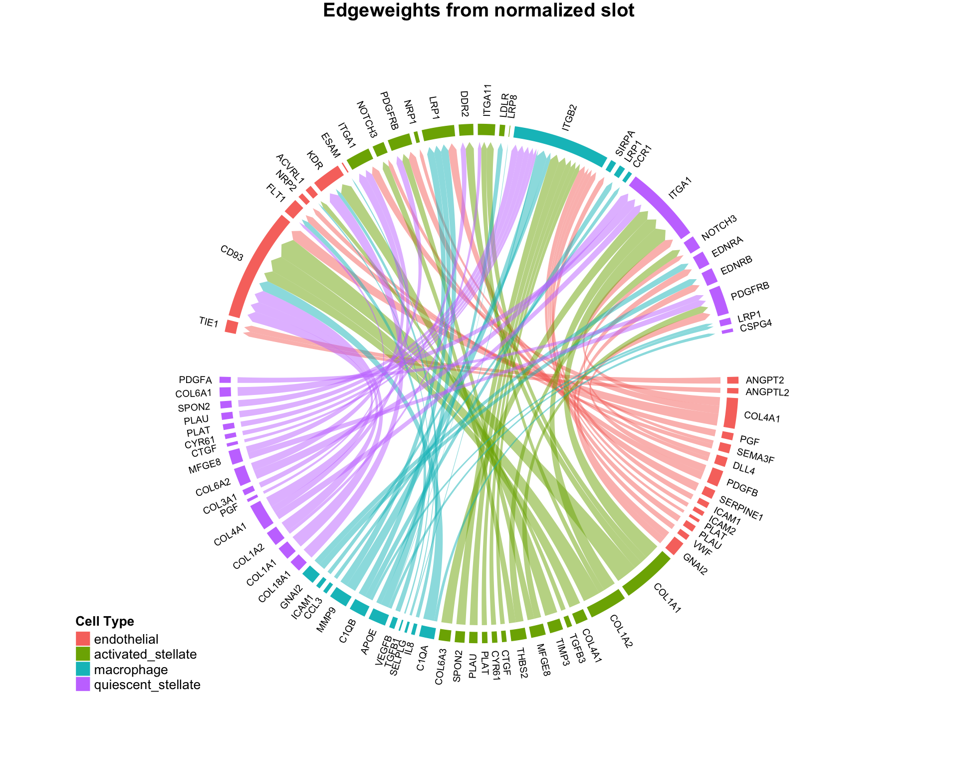

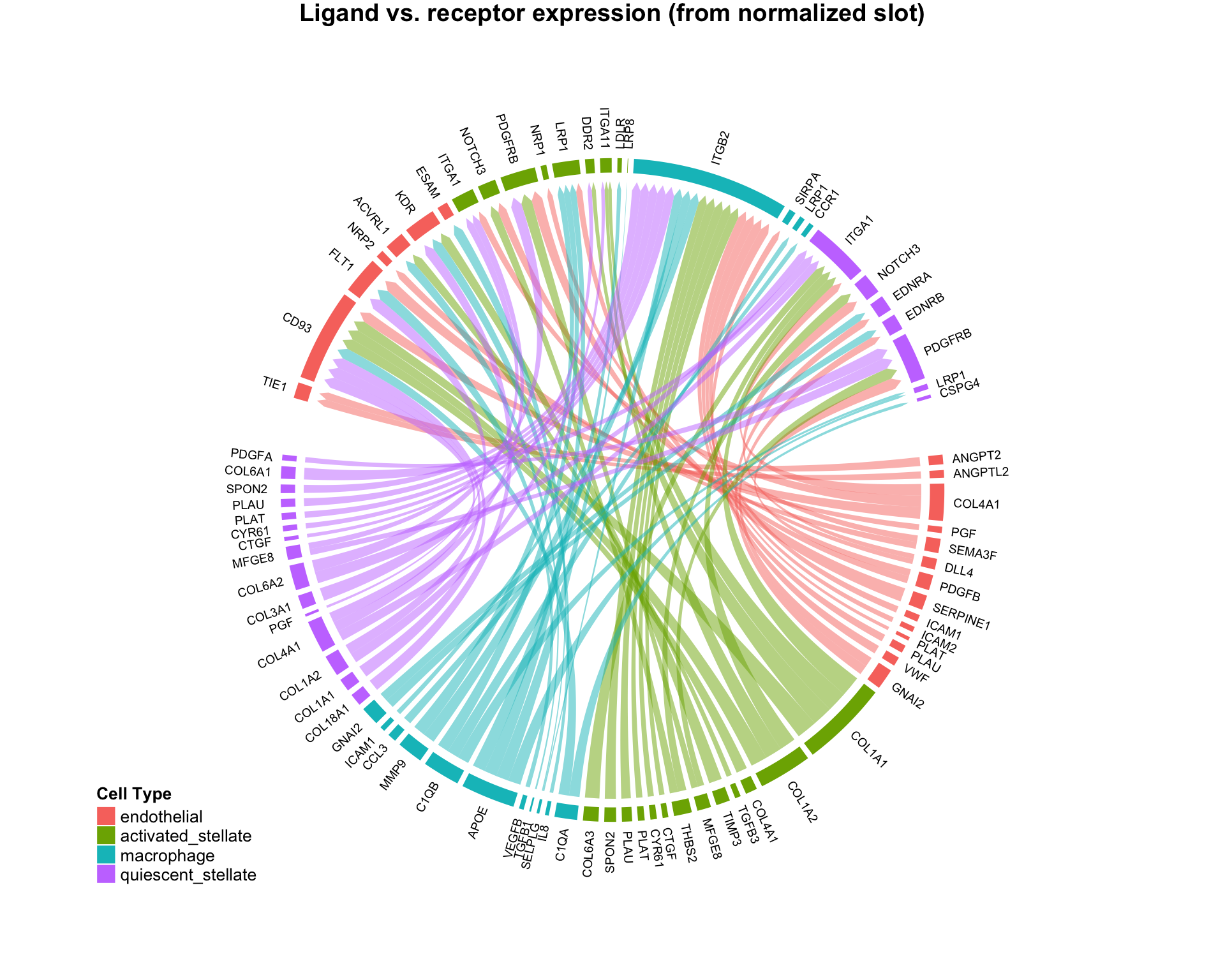
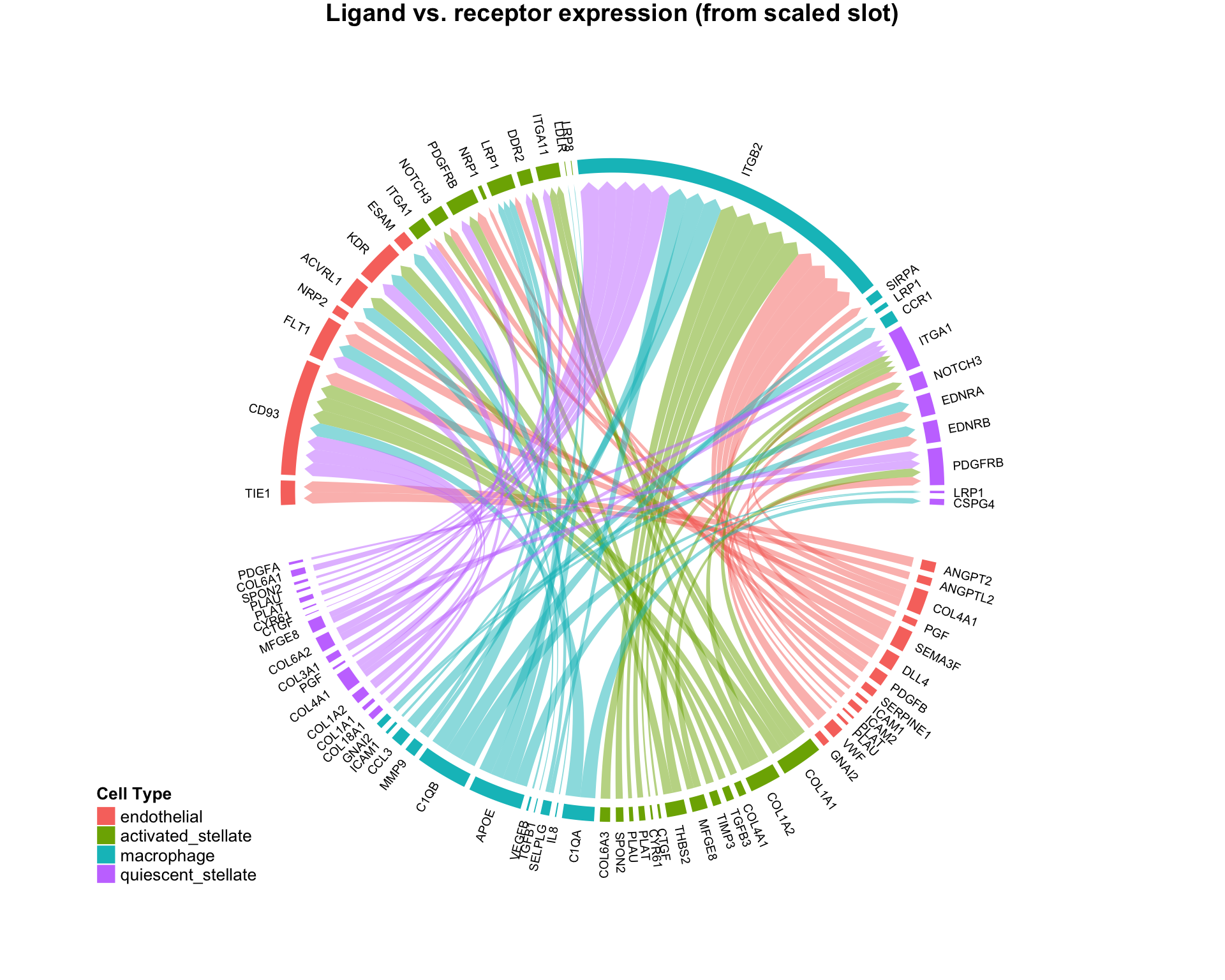
Although the 4 plots look similar, each is leveraging slightly different quantitative information. Appropriate use should be determined by the scientific question of interest.
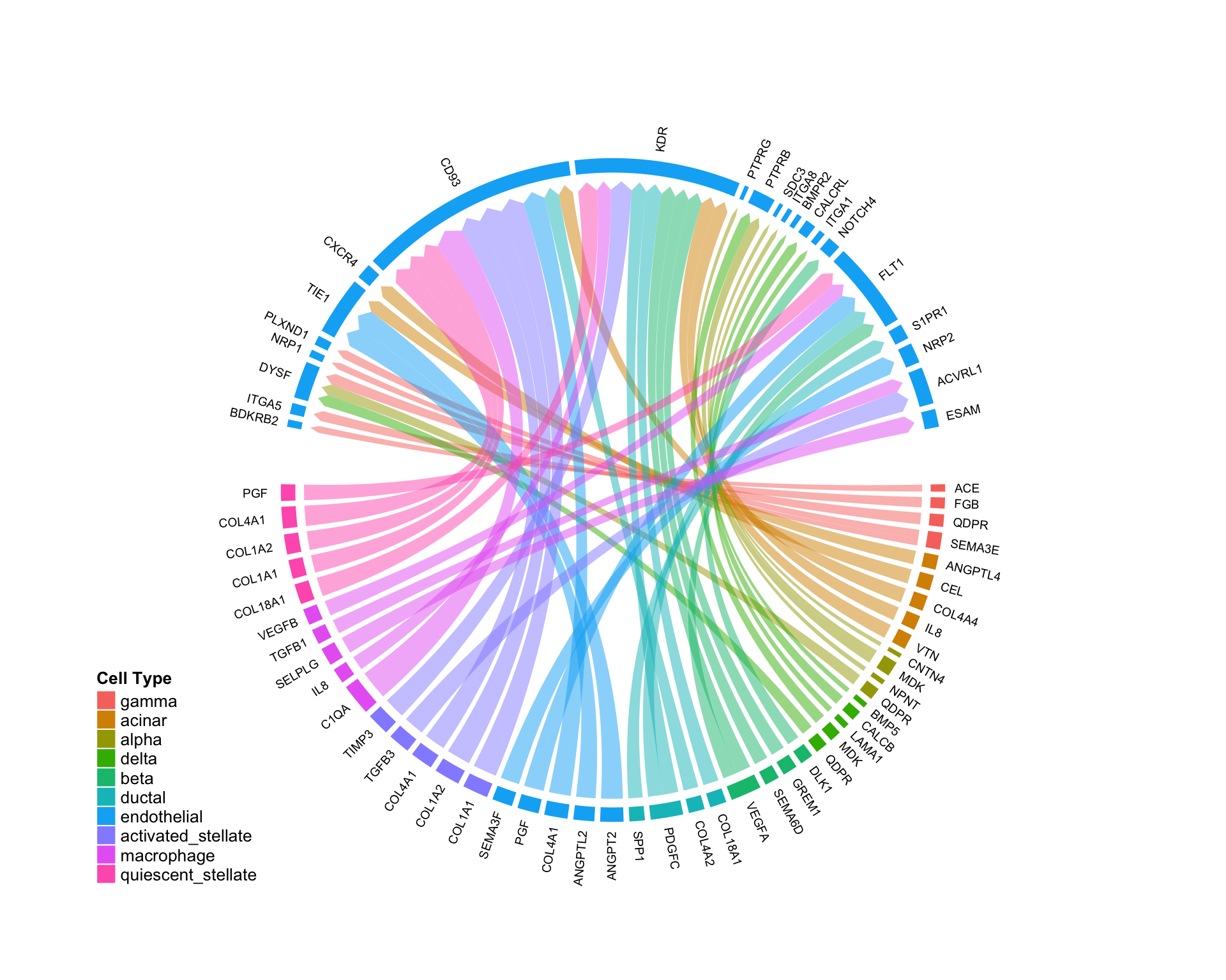
Niche-wise investigation:
Connectome can be used to visualize the cell-type specific “niche” network for a given cell type, showing all possible communication pathways converging on a given cell. This can be done leveraging the targets.include argument built into many of the above functions. Here, we choose to look at the endothelial niche in the pancreas:
CircosPlot(test,targets.include = 'endothelial',lab.cex = 0.6)
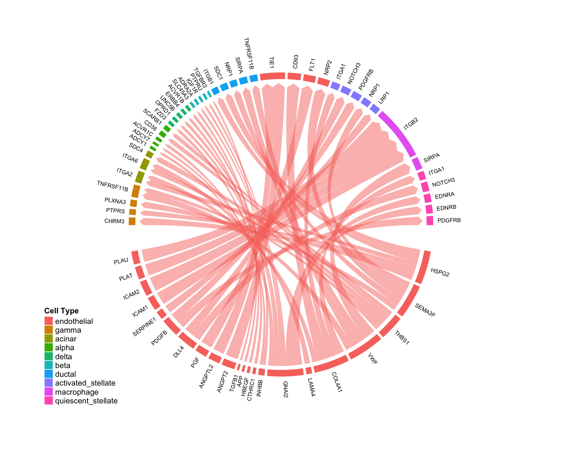
Source-wise investigation:
Similarly, the argument sources.include can be used to visualize all edges coming from a given cell type. This plot shows all of the cell-cell edges originating from endothelial cells in the pancreas:
CircosPlot(test,sources.include = 'endothelial',lab.cex = 0.6)
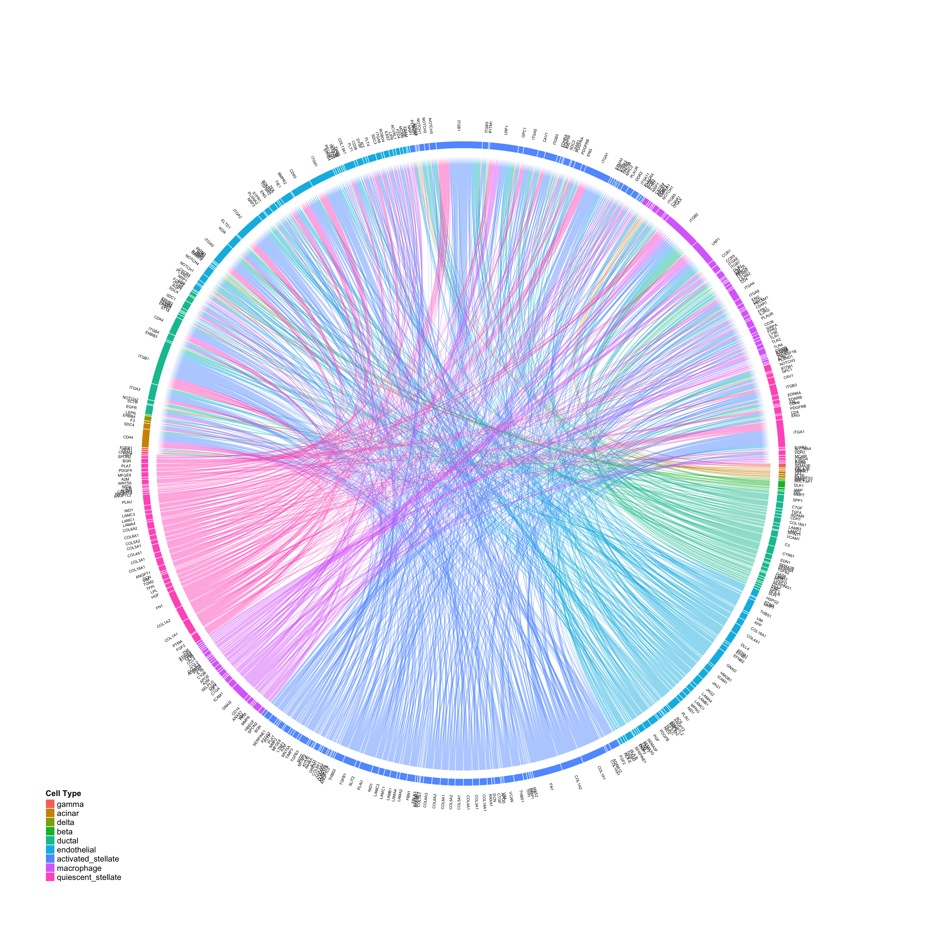
Large-scale visualizations
Although it can be difficult to intepret, Connectome can also be used to provide large-scale overviews of whole-tissue signaling networks in scRNAseq data:
CircosPlot(panc8.con2,min.z=1,lab.cex = 0.4,gap.degree = 0.1)